CTA Logo
The most fundamental visual element of the CTA identity is the CTA logo. Its thick line weights and bold presence make it powerful in any application. In place of a regular crossbar, the letter A features a mortarboard icon to reference education. This mortarboard can be used on its own in certain instances as detailed later in this reference guide.
CTA Primary Signature
The CTA logo and logotype combine to form the CTA signature. The flush left logotype signature is the suggested format when the signature appears alone. The logotype is created using Futura Bold.
Whenever possible, use the primary signature configuration of the CTA logo and logotype.
CTA Secondary Signature
The secondary signature configuration should also maintain a consistent amount of surrounding clear space.
Suggested uses
- Canva or PowerPoint footers for presentations
- Landscape web ads, flyers, or cards
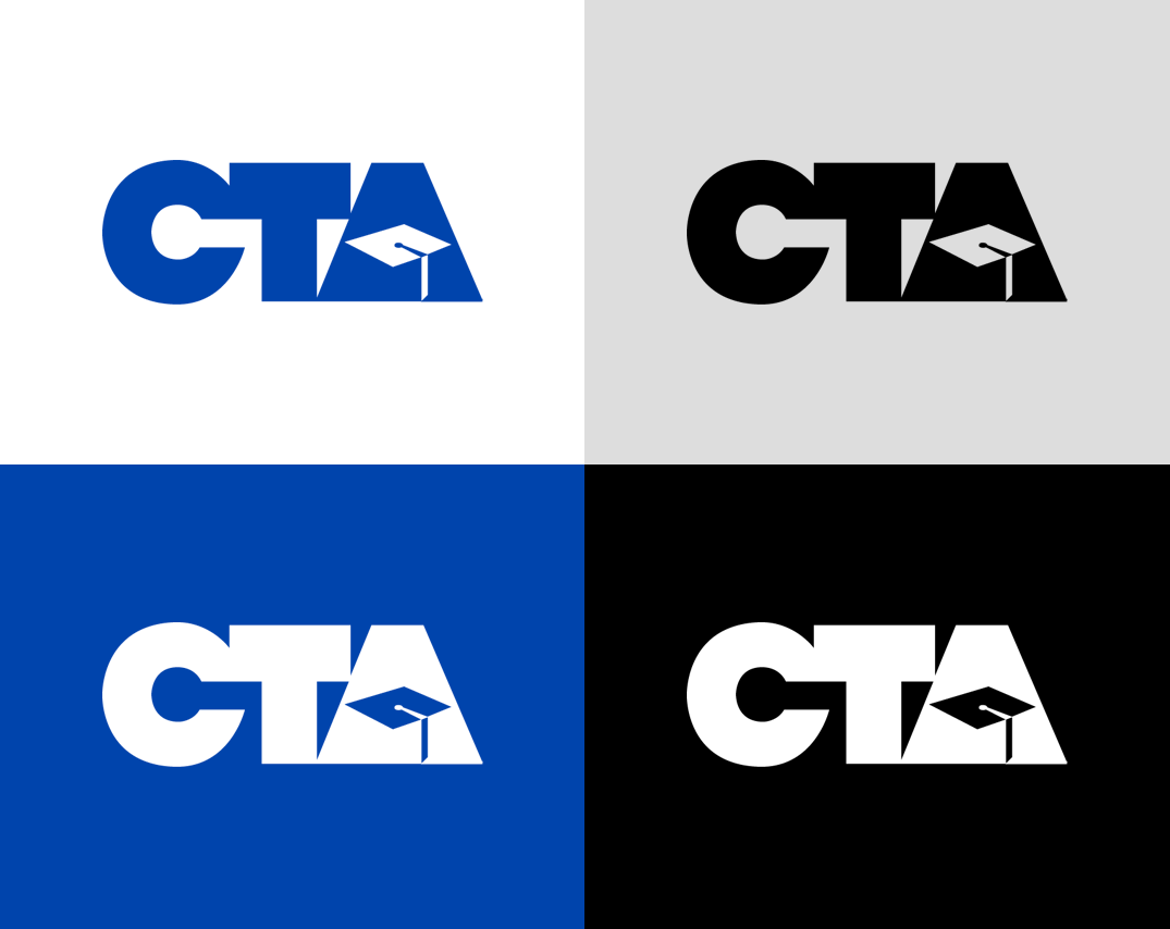
Logo Color Variations
The preferred usage of the CTA logo is in CTA blue on a white background. However, any of these approved color variations may be used as an alternative when necessary.
The logo itself must always appear in CTA blue, white, or black.
Please refer to the color palette guide above for official color codes.
Color Palette
The acronym ‘PMS’ refers to the Pantone Matching System which is a standard in the printing industry. In order to maintain the integrity of the CTA identity and to provide consistency in color, we request that when printing in one-color you use PMS 2728 C, when printing in 4-color you use the following build (C=98 M=82 Y=0 K=0), and when showing in RGB you use the following build (R=23 G=67 B=168). The equivalent web and digital color is #1743A6.
Digital
HEX – #1743A6
RGB – 23, 67, 178
PMS – 2728 C
CMYK – 98%, 82%, 0%, 0%
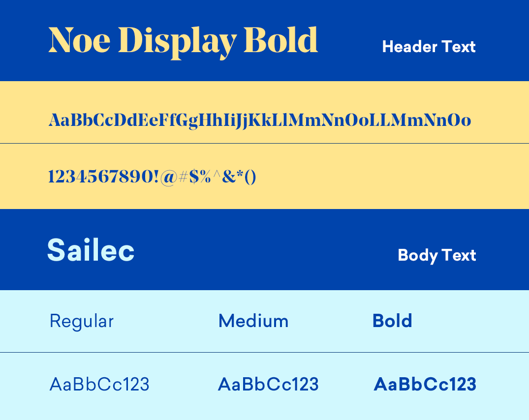
Typography
As the CTA identity has evolved, so has our use of type. The serif Noe Display Bold, our primary display typeface, sets a confident, modern tone for CTA printed collateral and digital communications. It also supports a wide range of applications.
The sans-serif Sailec has been selected for our secondary typeface within the CTA identity. Sailec is a very clean and geometric typeface that supports a wide range of applications. It’s available in three weights – regular, medium and bold – each with matching italics.
Header
Noe Display Bold
Body
Sailec
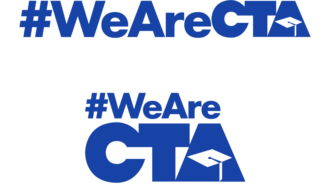
#WeAreCTA Logos
To allow greater flexibility, the #WeAreCTA logo has been designed in vertical and horizontal formats, with reversed options. Blue, white, and black versions of the logo are available for download below.
The #WeAreCTA versions of the CTA logo are to be used strictly for social media needs.